fifgo and fifgroup
A customer app and public website revamp for one of Indonesia's consumer finance groups.
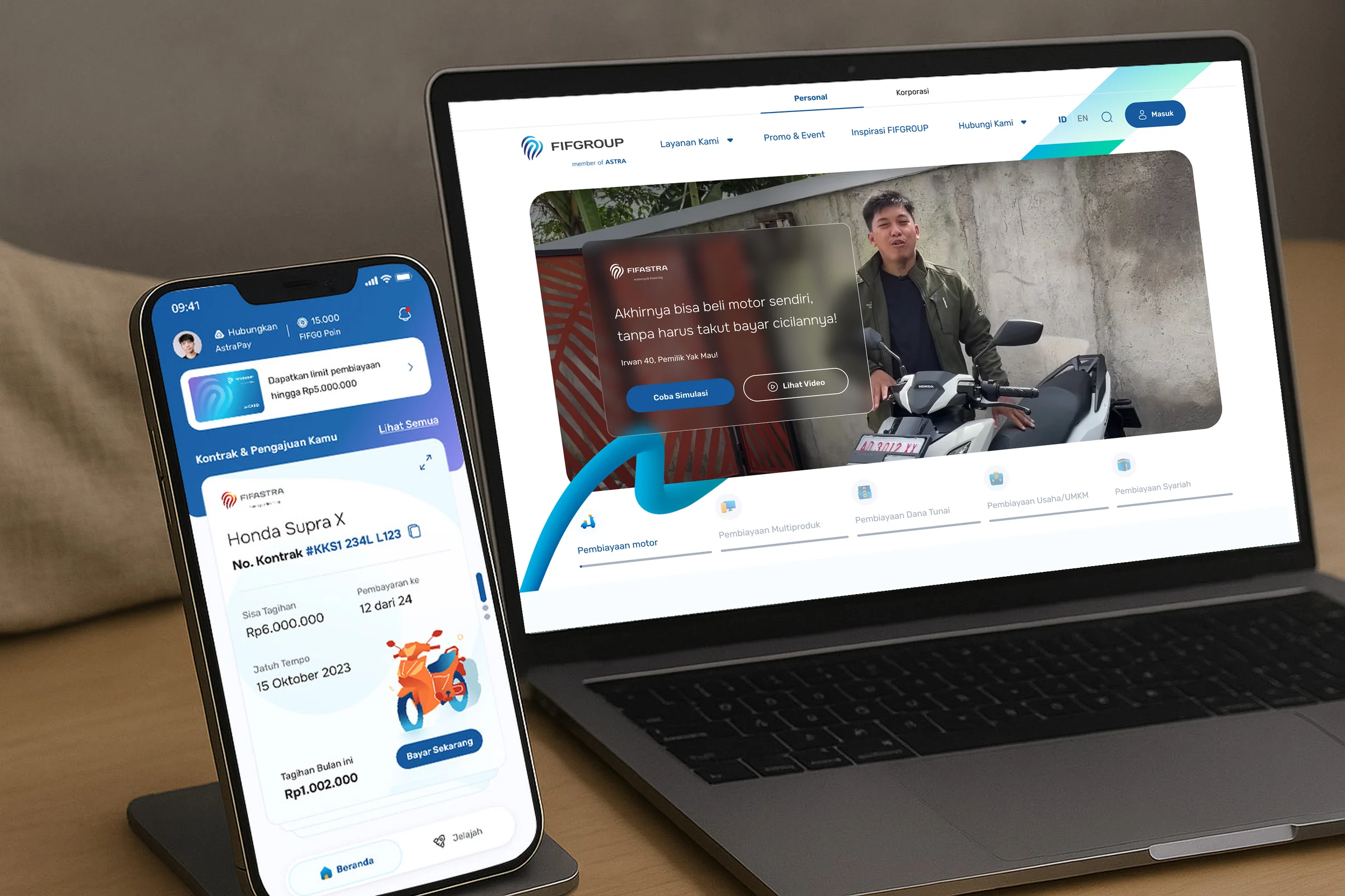
- Problem
- The website and customer app could not generate quality leads. Product information was inadequate, and the application and monitoring journey was too long and complex.
- Role and team
- UI/UX Designer at Aleph, working in a project team.
- Outcome
- In UAT, users completed the loan flow in under 7 minutes with zero drop-off.
- Timeline
- Sep 2023 – Feb 2024. The app and website are both live.
In mid-2023 FIFGROUP decided to revamp its website and consumer app, to keep up with technology, hold on to existing customers and win younger ones.
Our answer was a set of tools that understand what people need, guide them through it and give them the confidence to go ahead.
starting with the people
We worked human-centred, in cycles of analyze, create and test, and started by listening to the business and its customers.
38
Stakeholder interviews
3
Days of workshop
7
Journeys audited
4
Personas created
12
User test participants
2
Cities for user testing
four people, one worry
Taking on a loan is a big decision. Each persona was stuck in a different place, but all of them needed clearer information before they could commit. Across the research, security, relevancy and accountability mattered most.
young striver
Yoga, 24
Struggles to decide among too many unreliable loan options and fears unnecessary expenses.
Needs step-by-step guidance and a clear amount and duration to pay.
family treasurer
Fatima, 37
Overwhelmed by detail and a long approval process, and can't find the product that fits.
Needs digestible information and the ability to pick up where she left off.
assistance seeker
Ahmad, 44
Finds apps and manual form filling a hassle, and feels lost completing a journey online.
Needs to be recognised as an existing customer and given relevant recommendations.
opportunity chaser
Okta, 34
Very busy, wants to anticipate the risk of failure, and needs assurance before committing.
Needs flexible appointments and a tangible amount and loan duration.
three moments that mattered
We mapped the main customer journey into three phases and set what each one had to become.
Discovery
Be the effective discovery channel.
Promo offers felt aggressive and disturbing. Customers wanted relevant, trusted offers at the right moment.
Application
Boost efficiency so sales can focus on converting bookings.
Online applications were dominated by unintentional leads. Potential customers needed a simple, reliable process that encouraged them to apply.
Monitoring
Build a good relationship with good-performing customers.
Reach to good-performing customers was low. They needed a trusted channel that gave them assurance about their finances.
How might we provide a proactive, practical and clear platform for our users?
shorter steps to a loan
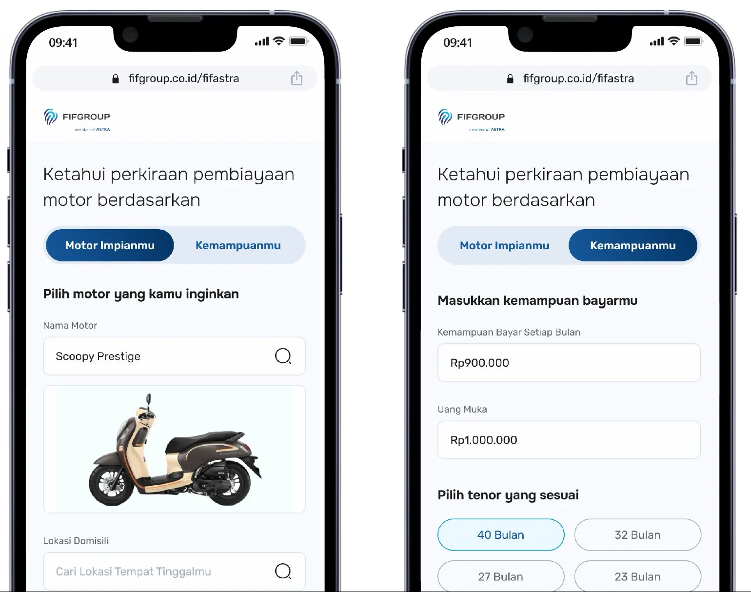
To reduce the struggle in applying, the journey now runs straight from simulation into application, personal data is prefilled through OCR, and the form focuses on essential information.
The loan simulation works from either direction. People can start from the motorcycle they want, or from what they can afford each month, so they see a realistic amount and duration before committing.
a contract you can actually read
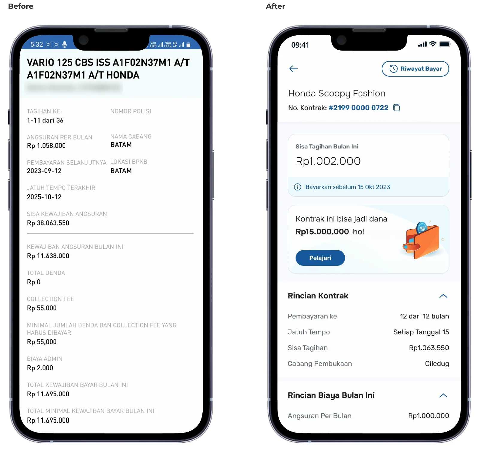
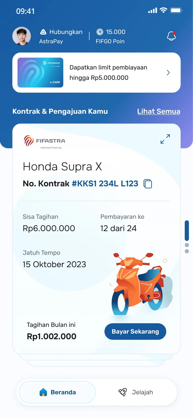
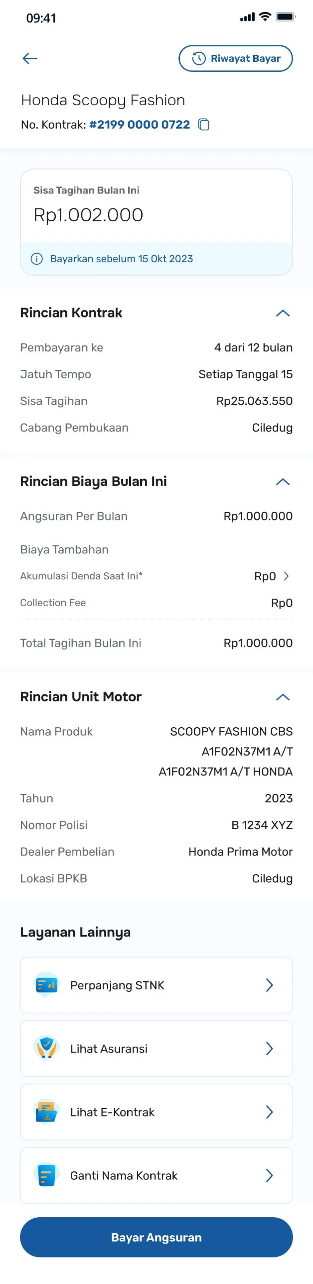
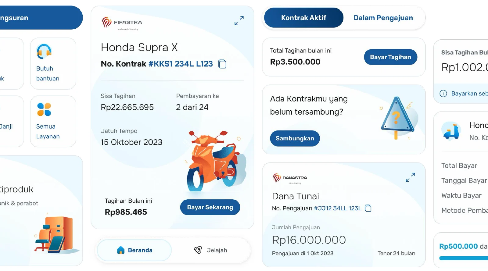
I revamped the mobile app's full loan-contract experience: application, payment, contract renewal, late fees and contract management. The old contract page was one long list of equally weighted labels and numbers, so we restructured the information around what customers look for first.
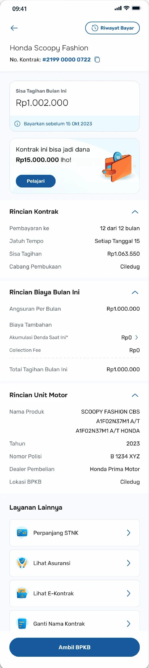
- sticky header
- A simplified, easy-to-find contract name and number.
- highlighted remaining bill
- The most important information about the bill comes first.
- cross-selling card
- Customers about to finish a contract see other loan products at the right moment.
- clear contract structure
- Contract information reads easily with better categorised sections.
- quick actions
- A dedicated section with visual icons, so the available actions are clear.
- floating payment button
- Nobody has to scroll to the bottom of the page to pay.

a website with more to say
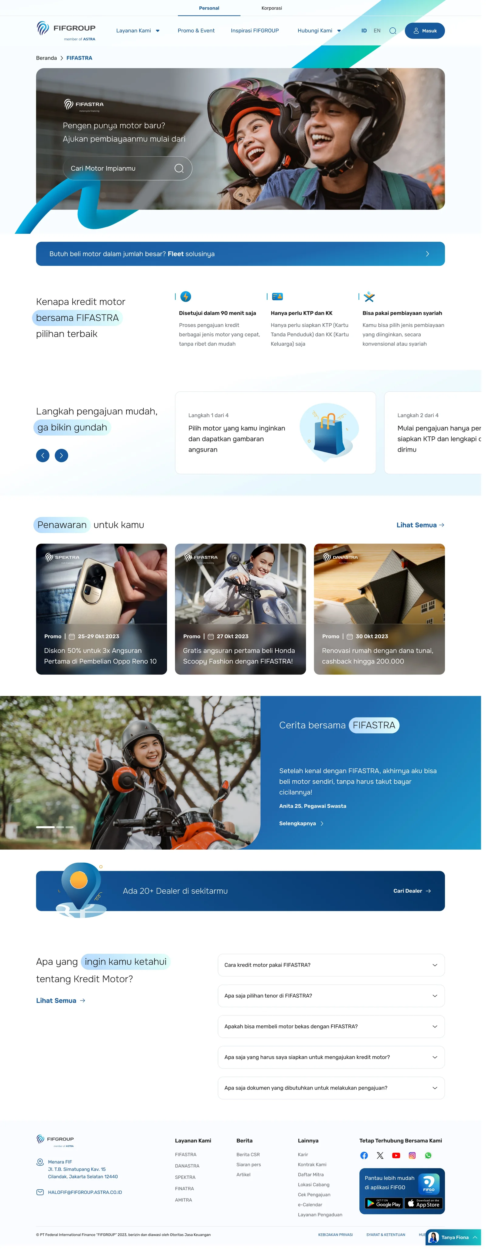
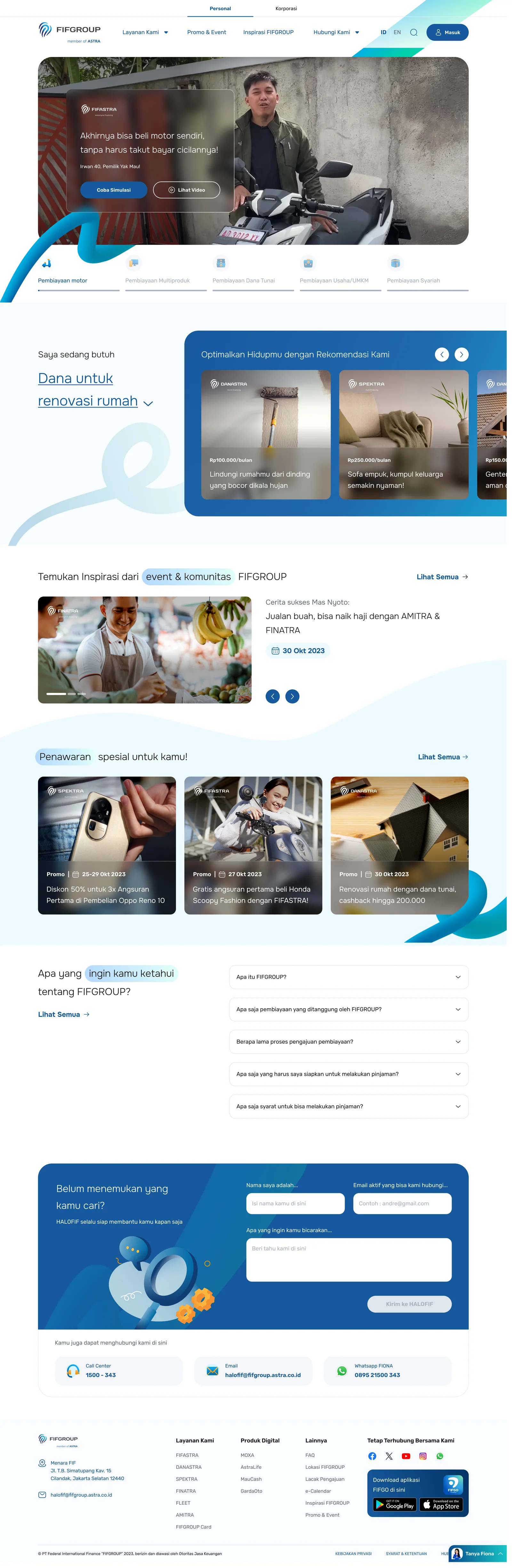
On the corporate side, stakeholders wanted FIFGROUP's online presence and content to feel more engaging. Inadequate product information was also part of the original problem, so the product page now leads with what someone wants to buy, then explains why to choose FIFASTRA, the four application steps and what to prepare. The group homepage starts from what the visitor needs and routes them to the right financing.
one visual language
An icon set carries both function and character, and the same components keep the design consistent across every digital platform.

result
In UAT, users completed the loan flow in under 7 minutes with zero drop-off. The FIFGO app and the FIFGROUP website have both been released.